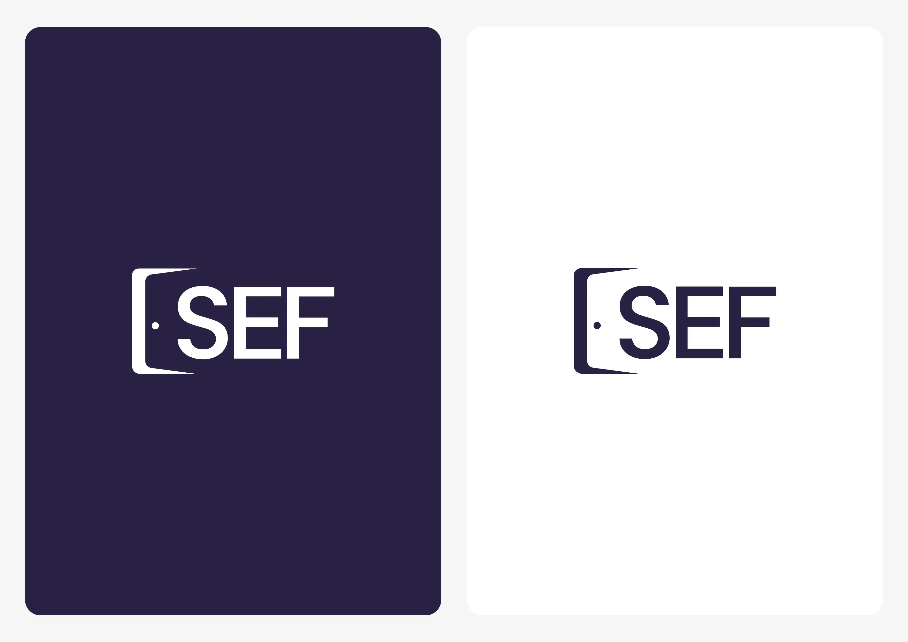
Skip to content

JavaScript is disabled

For a better experience, please enable JavaScript in your browser.

SEF

en

SEF

Logo for the non-profit organization SEF, designed to reflect their human commitment and their role in providing support.

Vignette du projet SEF

About the project

the projectAbout

Needs & Constraints

The non-profit organization SEF wanted a logo that clearly represented its mission: to welcome homeless people and help them find stability. The identity had to remain simple, accessible, and aligned with the colors already used on their website. The goal was to create a symbol that was immediately understandable, human, and positive, without falling into the stigmatizing imagery often associated with the social sector.

Approach & Implementation

To meet these needs, I designed a logo based on an integrated counter-shaped door, representing the idea of openness, welcome, and second chances. The colors dark blue verging on purple and white were chosen to reinforce trust, stability, and kindness, while ensuring visual continuity with their website. The final design, created in Illustrator, emphasizes simplicity, legibility, and symbolic impact, so that it works effectively on all of the non-profit's media.

Colorimetry of the project

of the projectColorimetry
  • Click to copy
  • Navy blue
  • White

Image gallery

galleryImage
Mockup du logo SEF sur une page
Variante de couleurs du logo SEF
Trait de construction du logo SEF